
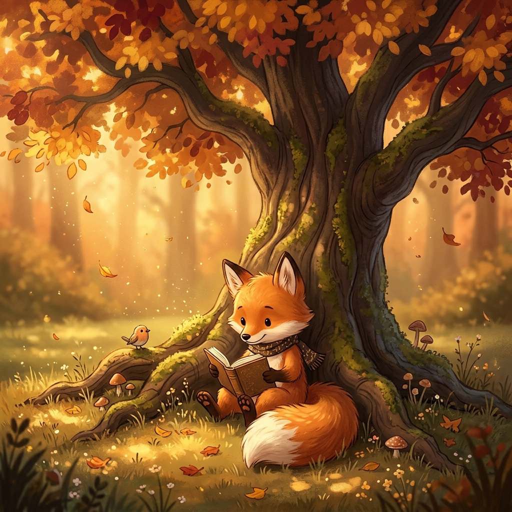
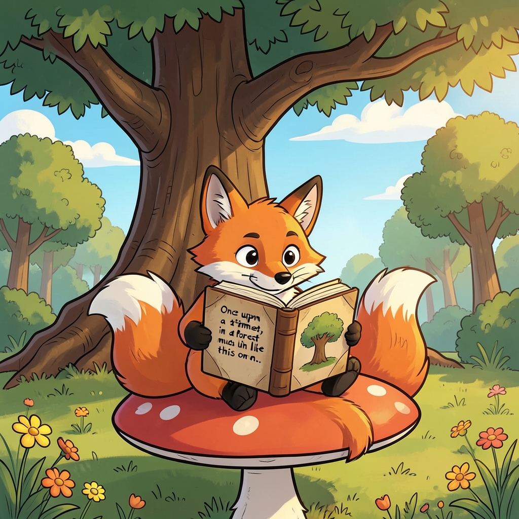

Two pictures of the same idea came out quite differently, and the difference is worth a look. Both show a young fox with a book at the foot of a big tree, and both lean on warm colors, but the first is painted in soft, misty autumn light, with drifting leaves, a small songbird and glowing dust in the air. The fox sits in a scarf, half-hidden by the trunk, and the mood is quiet and nostalgic. The second is brighter and more cartoonish: a daylight meadow, bold outlines, flat saturated color, and a fox perched on a red-capped mushroom. Its book even shows a line of text, "Once upon a time, in a forest...", which is a good example of the common AI problem with lettering: the words are almost readable but garbled.
What I find most interesting is how the prompt's "warm colors" was read. The first picture takes it as a mood: amber light, rust-red leaves, and atmosphere. The second takes it as a palette, with the warmth carried mostly by the fox's orange coat against cool greens and blue sky. If you want a single one to build on, the autumn painting has the stronger atmosphere, while the cartoon has cleaner shapes that would suit a children's book cover.
If you want more in this vein, Beatrix Potter's The Tale of Mr. Tod and the fox illustrations in Jan Brett's picture books show how illustrators handle warm light under trees.
