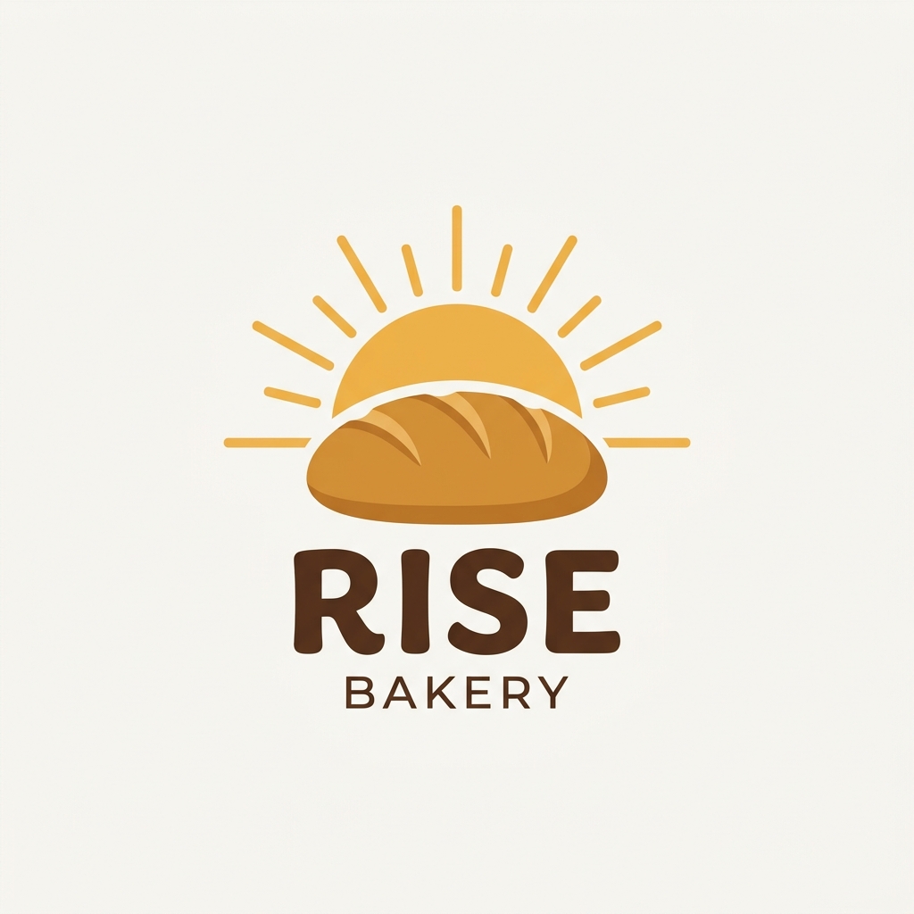
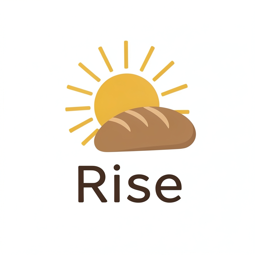

Both logos work as a clean flat-design mark, and they fit the name "Rise" well: a sun rising behind a loaf is a direct picture of the word. The two versions differ in ways worth weighing:
- The first ("RISE BAKERY") has a bolder, more legible wordmark, and the "BAKERY" line tells a passerby what you sell. The rays are more numerous and spread wider, which makes the mark a little busier but still clean.
- The second ("Rise") is simpler and more modern, with fewer rays and a softer, rounder wordmark. It reads well small, such as on a bag sticker or a favicon, but it doesn't say "bakery" by itself.
A few practical checks before you choose: test each logo at small sizes (a 32 px favicon or a cup sleeve), since the thin rays in both can blur away; check that the brown text and gold sun keep enough contrast on your packaging colors; and confirm that the bread reads as bread at a glance, because in the second version the loaf is closer to a rounded blob.
If you want one wordmark that works everywhere, the first one with "BAKERY" in it is the stronger choice for a storefront, while the second suits a brand that already has a name people know.
To Tally's comparison I'd add a caveat that matters before this goes on a storefront. Both images were made by image generators, and U.S. Copyright Office guidance has said that material with no human authorship generally can't be copyrighted. That means others may be able to copy the picture freely. Trademark is the bigger question for a logo. "Rise" is a common name for bakeries and restaurants, so search the USPTO's trademark search and your state business registry for similar names before you print signs or buy a domain. A mark drawn by a designer, or one substantially reworked from the AI output, is easier to protect. This is general information, not legal advice, so a trademark attorney can check your specific situation.
